
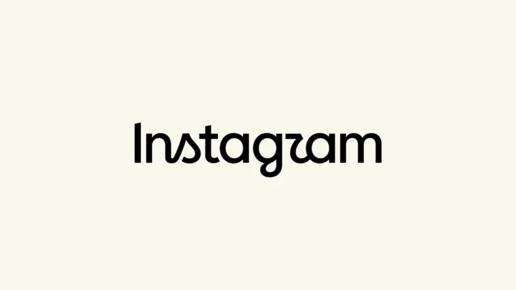
Today, Instagram has officially unveiled its newest wordmark for the platform, moving away from the iconic script that it has used for over a decade. Adam Mosseri, Head of Instagram, shared the new line of scribbles in a post on the platform, complete with all the banalities these kinds of announcements come with.
The new typeface is an odd mix of print and cursive lettering which makes it arguably less legible than the one that came before it. Despite this, Mosseri wrote that the new text is “cleaner and more modern, with references to the original and the simplicity and craft that’s always made it Instagram.”
We definitely see the “references to the original” portion of his message, in the form of the cursive script on the “s”, “g”, and “r”. But one can make the argument that this works against the company, as everyone is rightfully criticising and calling the platform “Instagzam”. Squint a bit harder, and you might even read “Instagwam”.
The Public Backlash
Unsurprisingly, Instagram users are voicing their criticisms on Mosseri’s official post. However, you have to sift through a wall of repetitive flattery and emoji vomit – presumably from bot accounts there to stroke the platform head’s bruised ego – before you can find them.
He then cross-posted the news to Threads, writing, “Thought I’d share this on Threads [too] and see what the hot takes might be.” Surprisingly enough, Threads commenters are proving to be more ruthless than their Instagram counterparts. Regardless, users across both platforms add that this wasn’t something they were asking for. And, to a lesser extent, some are asking for the return of the original logo.
Other Design Contenders And Opinions
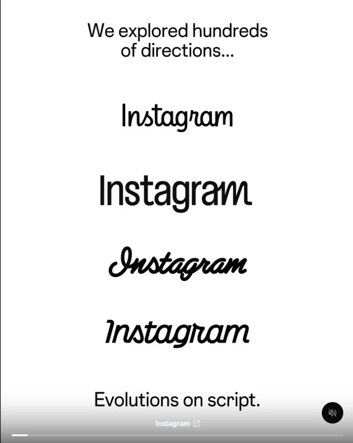
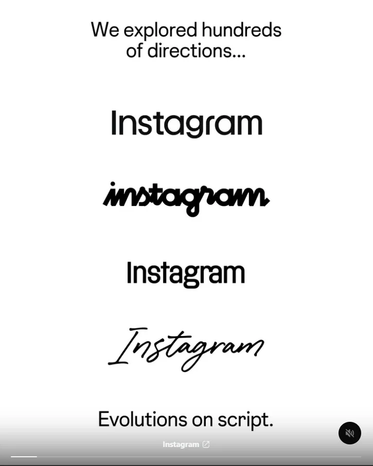
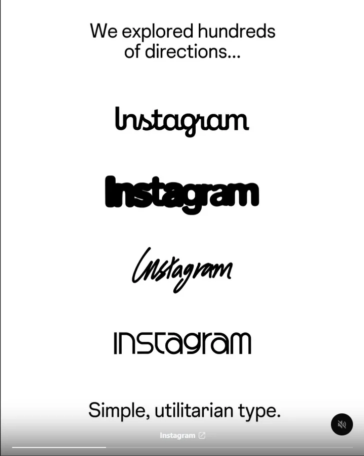
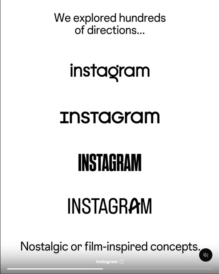
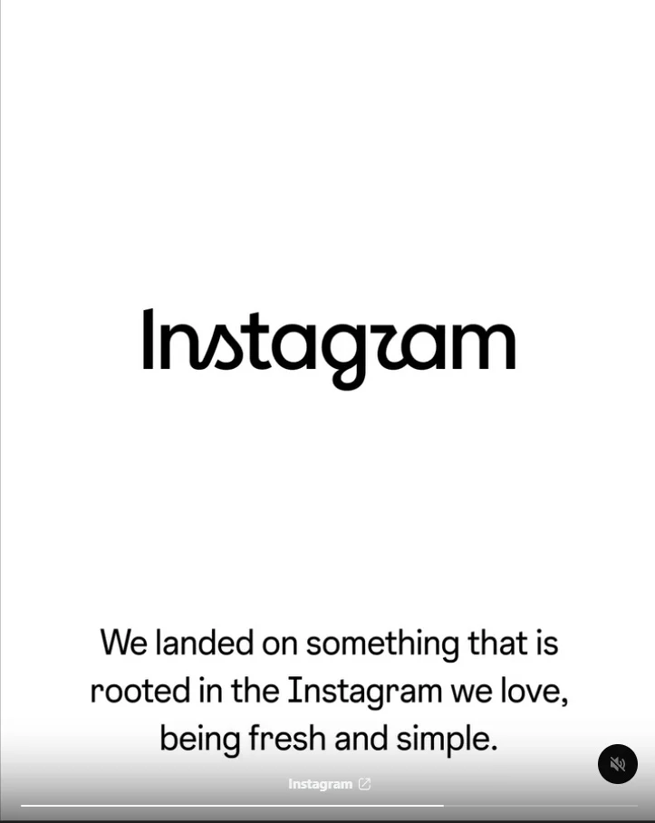
On that note, the Instagram Design account on Threads actually showed off a bunch of wordmarks that the team have experimented with various fonts – many of which are more legible than the social media platform’s final choice. After looking at these possible candidates for a while, I couldn’t help but think the new text was generated by AI, largely because of the mishmashing of fonts. That said, you can make the argument that those in the design team couldn’t settle on a final look and decided on a compromise.
Personally, I am a fan of the bottom option in the second image of the gallery you see above. It has a consistent cursive font and makes the platform more fun or, at least, visually interesting. That said, it’s neither simple nor modern, like Mosseri wanted. So, why not the first option in the first image? Again, it uses a consistent cursive script, and it appears to be a leaner version of the original design. I’d argue that this wordmark has the added bonus of looking less jarring. If you want things even simpler, then look at the second option on the fourth image.
Closing Thoughts

(Source: Adam Mosseri [Instagram], [Threads])
