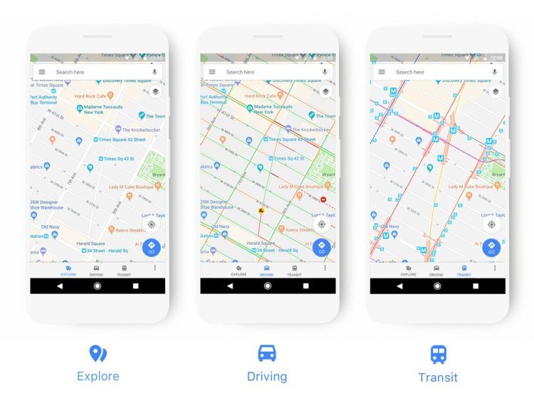
Google recently announced that they are rolling out a new look for Google Maps, bringing to you a “new look that better reflects your world, right now”. The new look will make it easier for you to identify places of interest on the map, and show you more relevant information depending on your travel methods.
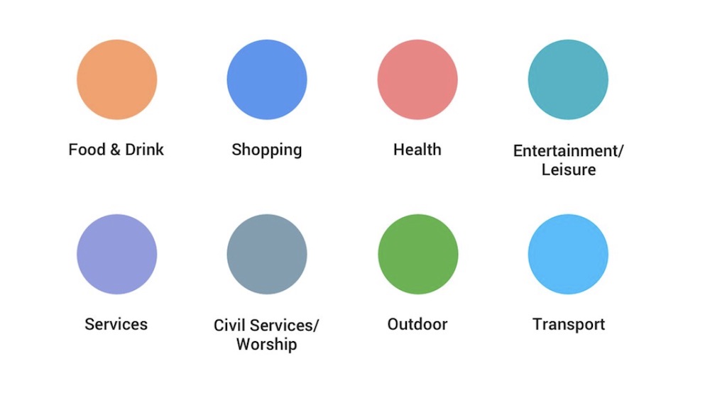
First up, you will be able to easily identify different places with a new colour scheme on Google Maps. Places such as café, museum, hospital, or places of worship will have a designated colour and icon, so you can quickly find what you are looking for at just a glance. For example, if you are in a neighbourhood you are not familiar with, and wish to find a coffee shop, just open the map and find the nearest orange icon, which is the colour for Food & Drink spots. Blue represent shopping spots, green for outdoor, and more as shown below:
The update will also push to you more relevant information as you are travelling. Google will only show you gas stations if you are navigating, and train stations for transit; why would you need to know where the nearest petrol station is when you are sitting in the LRT? This will also make Google Maps look less cluttered.
The changes will be rolled out over the next few weeks in all Google products that uses Google Maps. This includes Assistant, Search, Earth, and Android Auto. The new style will also appear in apps, website, and experiences offered by companies that uses Google Maps APIs as well, so you can have a consistent experience.
(Source: Google)


