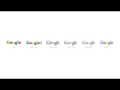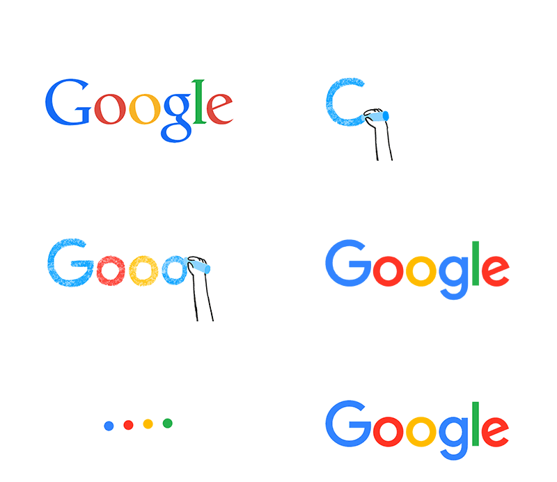
If you visit Google today, you would notice something different – the company has a new logo. It still looks similar with the same colourful letterings, but with a different typeface now for a more modern look.
The main “Google” logo isn’t the only thing the company is changing, the changes will be applied throughout Google’s suite of apps so if you check out Google+, Maps, News, Translate and such, you will see a slightly enhanced design featuring the new four-colour “G” logo, replacing the old blue “g”.
So, why a new look? Google says that over the years, they have evolved from something we only look for in a desktop PC to something we use everyday be it on the mobile phone, TV, watch, dashboard of the car, and of course, the desktop. This is why they need a new logo and identity family that “reflects this reality that shows you when Google magic is working for you, even on the tiniest screens”.
“It doesn’t simply tell you that you’re using Google, but also shows you how Google is working for you. For example, new elements like a colourful Google mic help you identify and interact with Google whether you’re talking, tapping or typing. Meanwhile, we’re bidding adieu to the little blue “g” icon and replacing it with a four-colour “G” that matches the logo.”
What do you think of Google’s new look?
(Source: Google via: The Verge)


